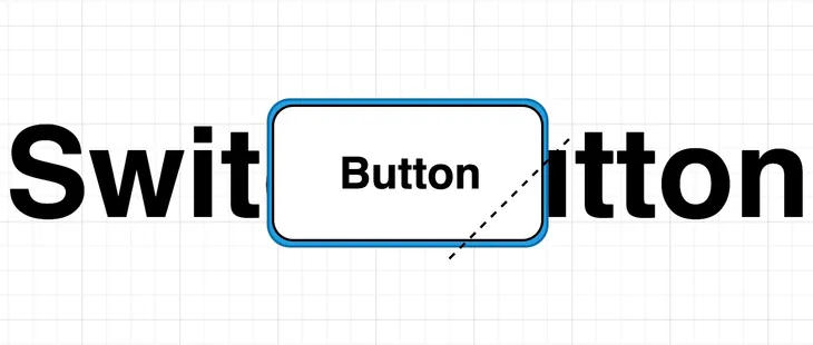
🚀 需求背景
在页面设计中,我们需要一个可切换状态的按钮,并且需要在按钮的右下角添加一个带圆角的不规则等腰三角形作为状态指示器。经过调研,发现Flutter现有组件无法直接满足需求,因此决定通过强大的 Canvas 自定义绘制来实现。

🎨 Canvas 基础概念
Flutter 提供了强大的 Canvas API,能绘制各种自定义图形。使用 Canvas 绘图,需要明确两个核心概念:
下面定义一个简单的画笔:
1
2
3
4
| Paint _paint = Paint()
..color = Colors.white
..style = PaintingStyle.fill
..strokeWidth = 2;
|
🛠️ 自定义圆角三角形绘制思路
我们需要绘制的图形由两部分组成:
- 圆角矩形:作为按钮底色的背景框。
- 带圆角的不规则三角形:作为按钮右下角的状态标识。
实现步骤为:
代码实现示意如下:
1
2
3
4
5
6
7
8
9
10
11
12
13
14
15
16
17
18
19
20
21
22
| class MyCustomPainter extends CustomPainter {
@override
void paint(Canvas canvas, Size size) {
var path = Path()
..moveTo(size.width, size.height)
..lineTo(size.width, size.height - 20)
..lineTo(size.width - 20, size.height)
..close();
canvas.clipPath(path);
Rect rect = Rect.fromPoints(const Offset(1, 1), Offset(size.width - 2, size.height - 2));
RRect rRect = RRect.fromRectAndRadius(rect, const Radius.circular(3.0));
canvas.drawRRect(rRect, _paint);
}
@override
bool shouldRepaint(CustomPainter oldDelegate) => false;
}
|
🚧 性能优化
开发过程中,通过日志打印发现按钮动画会导致 Canvas 重复绘制,造成额外的性能消耗。因此,可以通过 RepaintBoundary 包裹 Canvas 和按钮,避免不必要的重绘。
优化示例如下:
1
2
3
4
5
6
7
8
9
10
11
12
13
14
15
16
| RepaintBoundary(
child: CustomPaint(
size: const Size(200, 72),
foregroundPainter: MyCustomPainter(),
child: RepaintBoundary(
child: ElevatedButton(
onPressed: onPressed,
style: btnStyle ?? ElevatedButton.styleFrom(
padding: EdgeInsets.zero,
backgroundColor: Theme.of(context).primaryColor,
),
child: Text(text, style: const TextStyle(color: Colors.white, fontSize: 25)),
),
),
),
);
|
📌 封装与可复用性提升
为了提高组件的可复用性,按钮尺寸可以作为参数传入,自动计算和绘制对应的角标。该三角形角标在实际业务场景中常见,例如各类提示角标、状态标识等,美观且实用。
🚩 最终封装组件源码
1
2
3
4
5
6
7
8
9
10
11
12
13
14
15
16
17
18
19
20
21
22
23
24
25
26
27
28
29
30
31
32
33
34
35
36
37
38
39
40
41
42
43
44
45
46
47
48
49
50
51
52
53
54
55
56
57
58
59
60
61
62
63
|
class _SwitchButton extends StatelessWidget {
const _SwitchButton({required this.text, this.switchable = true, this.btnStyle, this.onPressed});
final String text;
final bool switchable;
final ButtonStyle? btnStyle;
final VoidCallback? onPressed;
@override
Widget build(BuildContext context) {
return SizedBox(
width: 200,
height: 72,
child: switchable
? RepaintBoundary(
child: CustomPaint(
size: const Size(200, 72),
foregroundPainter: MyCustomPainter(),
child: RepaintBoundary(
child: ElevatedButton(
onPressed: onPressed,
style: btnStyle ??
ElevatedButton.styleFrom(
padding: const EdgeInsets.all(0), backgroundColor: Theme.of(context).primaryColor),
child: Text(text, style: const TextStyle(color: Colors.white, fontSize: 25)),
))))
: ElevatedButton(
onPressed: onPressed,
style: btnStyle ??
ElevatedButton.styleFrom(
padding: const EdgeInsets.all(0), backgroundColor: Theme.of(context).primaryColor),
child: Text(text, style: const TextStyle(color: Colors.white, fontSize: 15))));
}
}
Paint _paint = Paint()
  ..color = Colors.white
  ..style = PaintingStyle.fill
  ..strokeWidth = 2;
class MyCustomPainter extends CustomPainter {
@override
void paint(Canvas canvas, Size size) {
var path = Path()
..moveTo(200, 72)
..lineTo(200, 52)
..lineTo(180, 72)
..close();
canvas.clipPath(path);
Rect rect = Rect.fromPoints(const Offset(1, 1), const Offset(198, 70));
RRect rRect = RRect.fromRectAndRadius(rect, const Radius.circular(3.0));
canvas.drawRRect(rRect, _paint);
}
@override
bool shouldRepaint(CustomPainter oldDelegate) => false;
}
|
通过以上方式,成功实现了一个带圆角三角形标识的可切换按钮,并通过合理优化保证了组件性能。
📎 参考文章